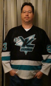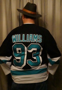

Jersey #4 of 40: Knoxville Cherokees (WILLIAMS, number 88)
Style: Replica
Size: XXL
Manufacturer: CCM
Obtained: Team sale, 1993
This jersey has been through hell and back. I’ve worn it to countless games when the Knoxville Cherokees were in the ECHL, worn it while playing roller hockey, street hockey, and football, even. I’ve worn it to school and work, and on road trips.
It’s showing its 22 years of age. There is a rip along the seam under one of the armpits, stains on the bottom stripe and on the logo, it’s been washed a few times. It looks like a relic from the teal colored logos that seemed to perpetuate hockey teams in the 90s. It’s not the most rugged of jerseys and I’ve almost outgrown the XL size horizontally (I NEED to go on a diet!).
But I’m not giving up this jersey for all the money in Tokyo.

In 1990 I started going to the Cherokees games. Their jersey, logo, and color scheme resembled that of the Chicago Blackhawks. I got hooked on hockey from the moment I saw my first game in person. From then on, I was sold that this was the best sport in the world.
The team was one of the best teams ever on the ice, in my opinion. Guys like Paul Laus, Daniel Gauthier, and David Williams would all go on to have careers in the NHL. The franchise had ups and downs. The first year they operated in the fledgling ECHL (1988-89), they were one of the best, 1989-90, the worst. 1990-91, one of the best again. 91-92, and the next year, forgetful, despite some players that would make it to the NHL (Greg Pankewicz, anyone?).
As can often be the case, when there’s not much to cheer for on the ice, the results can be disastrous off the ice. The attendance dropped significantly during 92-93, the team had little promotions going on, cost-cutting seemed to be the name of the game, and the rumors started flying that the team was going to cease operations sooner rather than later. In fact, the franchise did cease operations after the end of the 92-93 regular season. Talk about a letdown…
However, the fans rallied, begged, pleaded, and committed to showing the city that there was a need for pro hockey in East Tennessee. And someone listened. The team re-started a few weeks later, and decided to put a lot of eggs into their basket. They dropped the old indian head logo, and got a new logo, new colors, and a new attitude. They also secured affiliations with the young franchise Tampa Bay Lightning and the Atlanta Knights (in the International Hockey League) as well as the Las Vegas Thunder (also in the IHL) and had a celebrity of sorts in their ranks, as Manon Rheaume was assigned by the Lightning to get some playing time in Knoxville. She was the first female goaltender to play in an NHL game (pre-season) and was well-known throughout the hockey world. Unfortunately the novelty wore off quickly and she was sent to the Nashville Knights towards the end of the 93-94 season.

With that new style, I decided to invest in the change and purchased a jersey for myself. I had it customized with my name and I chose #93 because that was the year this all occurred, and I believed the Cherokees were going to set the hockey world on edge.
Unfortunately they got eliminated in the first round of the playoffs in 93-94 and would be off and on for the next 3 seasons. Their last season, the attendance was decent, but the public squabbles with the city over the rent of the Coliseum, and income on concessions and parking (one of the most disadvantageous of any franchise in the ECHL or any league for that matter) forced the franchise to move to Florence, SC in 1997 and became the Pee Dee Pride.
It tore a chunk out of my heart when they left. Although hockey would soon return a couple of years later, the damage was done for some fans who would seldom if ever return to see hockey in Knoxville. I welcomed it, and embraced the Knoxville Speed (even though I hated the logo) in the United Hockey League (UHL) but it certainly lost some of the sheen that the ECHL Cherokees brought to the ice at times.
I still wore my jersey until a few years ago. It has shown its wear and tear well and sometimes I wonder if the next time I wear it (like when I took the above pictures) it was going to rip right in half.
The logo epitimizes that 90’s feel. The teal color seemed to be a popular color of many franchises in the 90’s. San Jose more or less started the trend and teams like Las Vegas’ Thunder wore it as well. The feathered “K” wasn’t a big hit with logo connoisseurs (I can’t find any articles, however) but I do recall some publications choosing it was the worst logo and jersey layout, with only 1 or two teams even worse. However, it was a big seller, not just in Knoxville, but around North America.
I’ve worn it while playing roller hockey in a couple of venues, I’d wear it skating around the Icearium or the Ice Chalet, I wore it to school, work, anywhere I felt like showing it off. If I wore it to the mall, heads would turn. I once wore it to Greensboro, NC, to see a hockey game between the Monarchs and the Nashville Knights in the playoffs and got a LOT of stares…
It has the most mileage of any of my jerseys by far, and is not for sale.
Monday: Another Ice Bears jersey…

[…] the Knoxville Cherokees revamped their logo in 1993, they took up an affiliation with the Lightning, and were assigned Manon Rheaume, the first female […]
LikeLike
[…] played for Detroit and Tampa Bay as a goalie. I suspect that this was customized for a fan (same as my Cherokees jersey), or the name was misspelled while getting it customized for a Hodson fan, […]
LikeLike